BetterTypeRight
0
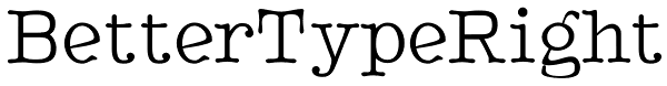
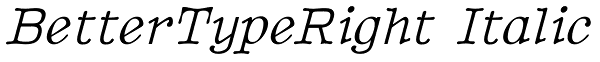
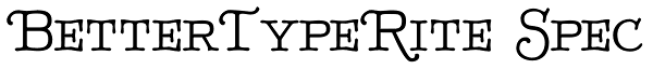
BetterTypeRight has large serifs, a very high x-height, and little variation between horizontal and diagonal elements. It has the feel of a typewriter typeface, but it is not monospaced. Note the swash/small-caps versions.
Styles
BetterTypeRight
BetterTypeRight Bold

BetterTypeRight Bold Italic

BetterTypeRight Italic
BetterTypeRight Medium

BetterTypeRite Spec
BetterTypeRite Spec Bold

BetterTypeRight Thin
BetterTypeRight Thin Italic

License
BetterTypeRight by Ingrimayne Type is sold/licensed through myfonts.com. See the license on the My Fonts website for more information.
Contributors
Do the tags or description need some work? Propose an edit and earn rep.